Simplified navigation
A left sidebar menu that is collapsible and compatible with CMS, for those not using Standalone.
CiviCRM Make It Happen - Lighthouse Navigation
A modernized menu and unified search will help people find what they need faster, reduce training time, and make CiviCRM all around more enjoyable to use.
What community members have said
The interface is dated compared to other CRM products.
The menu is a bit intense.
Fairly complex config and menu structure, not easy to manage.
Sample feedback from actual users in the 2025 CiviCRM User Survey
The Situation
When navigation feels overwhelming, it can make end users feel like they are doing something wrong. But they're not.
For some organizations, that first impression is enough to stop adoption of CiviCRM before it even begins. And that's a big problem when growing the ecosystem is critical in the times of AI and other competitive forces.
Sure, we all want access to features and to explore what is possible, but nonprofit staff typically do not have time for such things. They are trying to serve people, raise funds, run events, and keep programs moving. And that can lead to useful features that are underused. What they want it to be intuitive and smooth.
Put simply, we know the menu needs work, especially to remain competitive with other CRM's on the market.
Interface Direction
This early mockup from CiviCon 2025 shows the proposed direction that would be formally defined during the first phase.
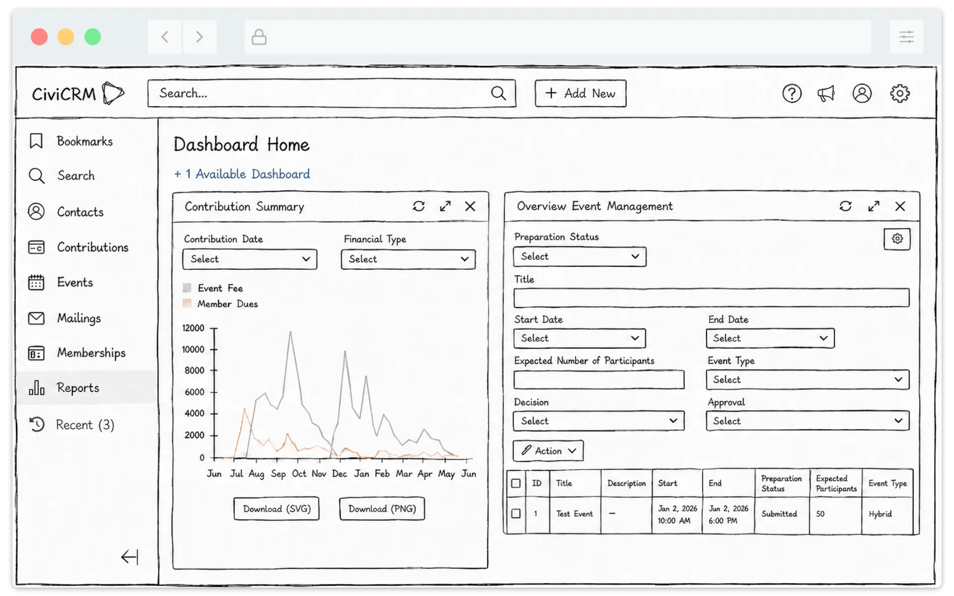
A left sidebar menu that is collapsible and compatible with CMS, for those not using Standalone.
A global search bar and create actions sit prominently at the top.
Help, notifications, your user profile, and admin settings stay easy to find when you need them.
Benefits
Find data and reports faster, spend less time training, and get to harnessing the power of CiviCRM better.
Better customization options: configure menus and assign them to regions through a UI, and support Search Kit and Form Builder so organization-specific needs are easier to deliver.
Find contacts, contributions, memberships, and other records in one place.
Role-based menus reduce clutter and show people what they need.
Quickly create and manage records.
Connect users to DocBot, documentation, CiviAcademy and partner support to encourage more community participation.
Voluntarily share issue feedback back to CiviCRM Core Team and see relevant product updates.
Make navigation easier to extend, configure, and customize for specific use cases. e.g. mobile menu for canvassing.
Development roadmap
The roadmap is organized into two major phases, delivered through five staged milestones. Phase 1 establishes the direction and a usable public beta extension you can install. Phase 2 builds on that foundation as funding allows. And you're participation through feedback is welcome all along the way!
Phase 1a
A validated design direction and technical architecture.
Phase 1b
A usable public beta that establishes the new menu framework.
Phase 2a
Menus become highly configurable allowing organizations to tailore them to specific roles.
Phase 2b
Adds support and communications area to increase community feedback, and access to community and professional partner resources.
Phase 2c
A polished, accessible implementation ready for core review.
Why we need your financial support now
Improvements like this do not happen automatically; it takes organizations that rely on CiviCRM to invest in its future, especially in the age of AI disruption. Now is the time to have a hand in making it better for everyone.
Let's keep the momentum up after the recent RiverLea framework success. This is a practical, phased investment in making CiviCRM easier to use, a higher adoption rate, and more valuable for the organizations that depend on it.
Support the campaign!